Design da Proposta de Valor
Resposta rápida
O design de proposta de valor é um método estruturado para alinhar uma oferta com os trabalhos, dores e ganhos de um cliente, e depois testar se o ajuste é real.
Alexander Osterwalder, Yves Pigneur, Gregory Bernarda, and Alan Smith published Value Proposition Design in 2014. The method they described is a structured way of matching an offering to the specific jobs, pains, and gains of a defined customer segment, and the central tool they built for it is the Value Proposition Canvas, a one-page diagram that maps a customer profile against an offering to expose whether the fit is real.
Every competing page covers the definitions and omits the sequencing failures. The canvas is a discovery tool that most teams run as a confirmation tool. They fill in the half that describes their product first, then populate the customer's needs with whatever happens to justify what they already plan to build. The result looks like a finished canvas and behaves like a sales pitch to oneself. The canvas's own publisher documents this failure, and so does its lead author. This page leads with that failure, because understanding why the method breaks is more useful than memorizing the boxes.
TL;DR
- Value proposition design is the process. A value proposition is the output sentence it produces.
- The Value Proposition Canvas has two halves: the Customer Profile and the Value Map.
- Fit is validated alignment, not tidy overlap on a diagram.
- Three fits must be earned in order: problem-solution, product-market, business-model.
- Most teams fill the Value Map first, which turns discovery into confirmation.
- A finished canvas is a hypothesis document. Testing starts when it is full.
What is value proposition design?
Value proposition design is the design discipline for figuring out what an offering should do for whom, before committing to build it. The value proposition is its output: the one- or two-sentence claim the process produces. A value proposition is the resulting claim, the sentence a company makes about the value it delivers. The method is the work that earns that sentence.
A generic value proposition sends the writer back to the sentence, to the adjective, to the comma. The failure is not there. The failure is upstream, in the design that produced the claim, in the need that was never found. Strategyzer's method documentation makes this plain: no rewrite of the words will fix a value proposition that had no ground beneath it.
Who uses it: product managers deciding what to build next, innovation teams running design thinking on a new concept, open innovation programs evaluating external ideas, founders validating a startup idea, and B2B service designers. The method has reach outside the startup workshop circuit. It appears as a credited approach in service-engineering research on smart-service business models, suggesting the true audience is anyone who needs to know whether an offering solves a real problem before committing budget.
How does the Value Proposition Canvas work?
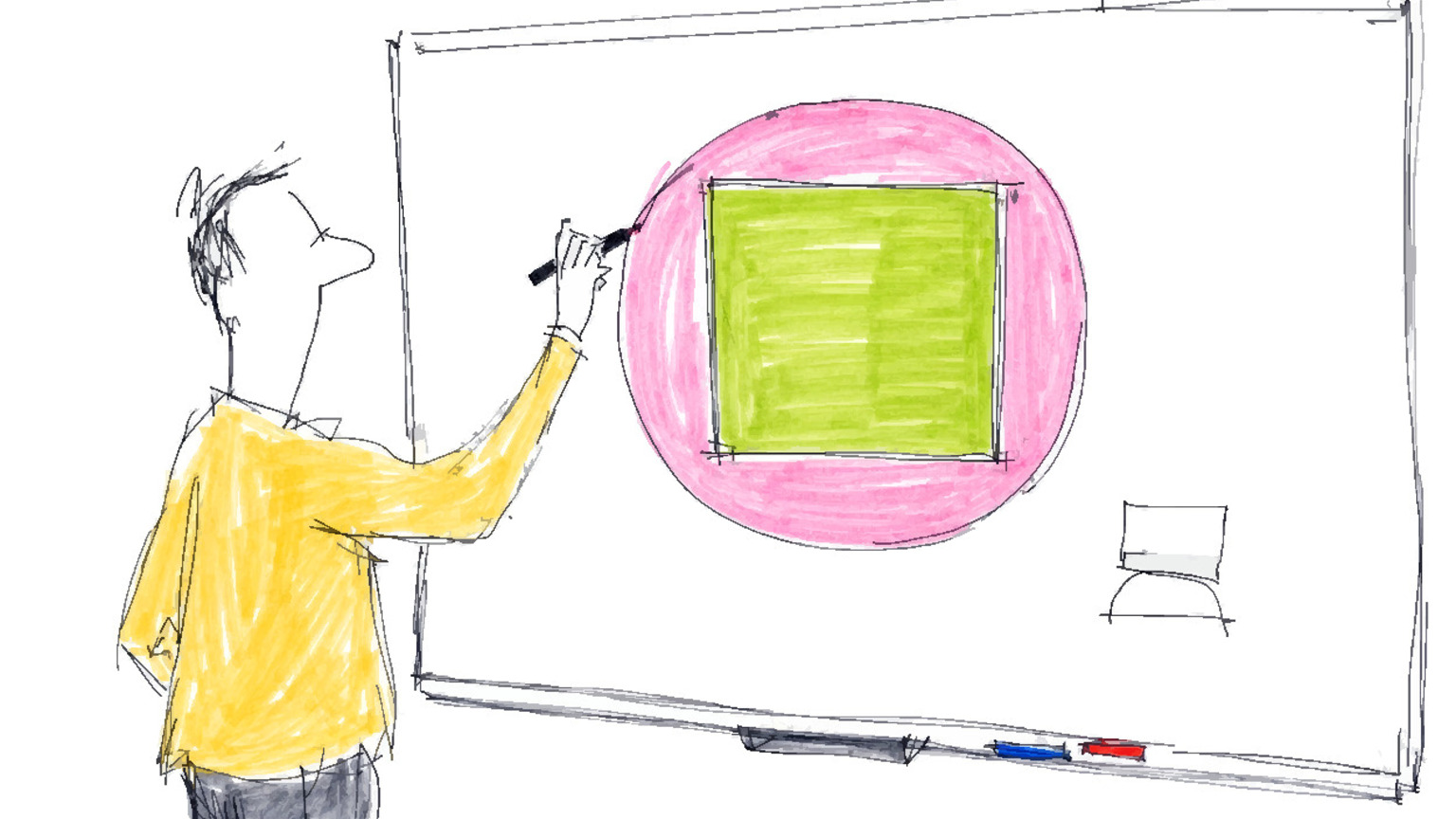
The Value Proposition Canvas is a one-page tool with two linked shapes: a circle on the right for the Customer Profile and a square on the left for the Value Map. The two are designed to face each other. The canvas reaches fit when the square's outputs, the pain relievers and gain creators, address the highest-priority items in the circle.
Each shape encodes a distinct domain of inquiry: the circle is the customer's world, the square is the offering's response. The circle is the customer's world, the part you cannot control, the part you can only watch. The square is your offering, the part you can move. The layout insists on the order: the square faces the circle, the controllable answers to the uncontrollable, and never the other way around.
Each half decomposes into three components. On the left, the Value Map contains: products and services (the offering inventory), pain relievers (how the offering removes specific pains), and gain creators (how the offering produces specific gains). On the right, the Customer Profile maps customer jobs (what the customer is trying to get done), pains (obstacles, risks, and bad outcomes), and gains (desired outcomes and benefits). Every component on the left should earn its place by addressing a specific component on the right.
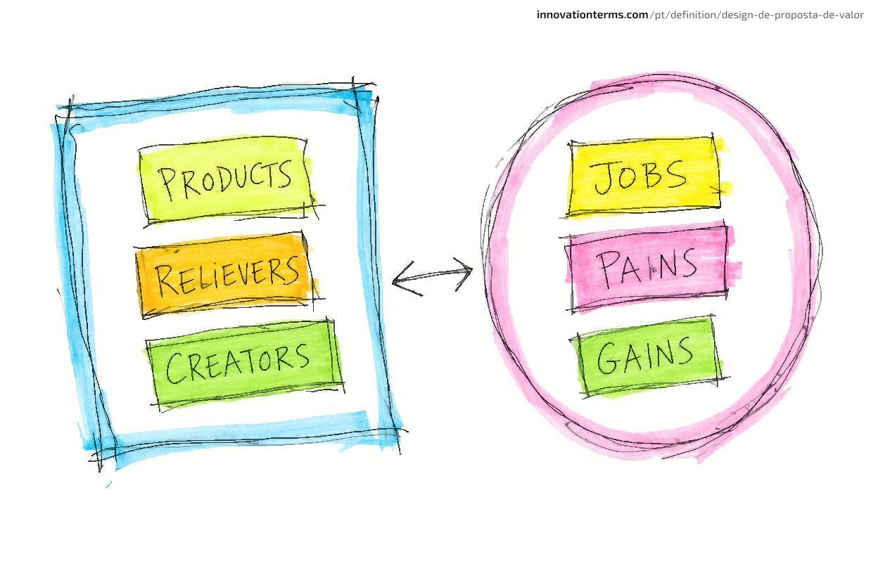
Strategyzer's official canvas explainer describes the canvas as a tool to "design, test, build and manage" value propositions and to show the fit between what you offer and what customers want. The two verbs in the middle, test and manage, are the ones competitors skip. They are also the ones that separate a discovery tool from a poster.
What belongs in the Customer Profile?
The Customer Profile captures three things about one customer segment: their jobs, their pains, and their gains. A misread segment or shallow jobs corrupt everything built above them.
Customer jobs come in three types
A customer job is what someone is trying to accomplish, and jobs are rarely just functional. Value Proposition Design names three kinds. Functional jobs are concrete tasks: file a tax return, get to a meeting, store project files. Social jobs are about perception: how the customer wants to be seen by peers, a manager, or a client. Emotional jobs are about internal state: feeling secure, feeling competent, avoiding anxiety.
The functional job captures the task; the social and emotional jobs capture the purchase driver. A project manager buying software has a functional job (manage the project), but the purchase is often driven by the need to look in control to a director and stop dreading the weekly status call. Offerings that serve only the functional job lose to offerings that quietly serve all three.
Pains and gains are not mirror images
Pains are what gets in the way: the risk, the bad outcome, the obstacle around the job. Gains are what the customer actually wants. The easy mistake is to read gains as the absence of pains. They are not. Erase a pain and the customer is merely even. Create a gain and the customer is somewhere better. A package that arrives on time removes a pain. A package that arrives with a tracking link the customer can forward to their client creates a gain. The second is not the first, inverted.
The discipline that separates a real profile from a fabricated one is evidence. Pokorna et al. (2015) built a Customer Profile for farmers'-market shoppers from a survey of 217 customers and found the dominant jobs were "stocking up on fresh and healthy food and feeling good about the purchases," with higher prices as the leading pain. That profile was discovered, not assumed. Back-filling is the default, not the exception.
What belongs in the Value Map?
The Value Map describes your offering, but only in terms of how it answers the Customer Profile. It has three components: products and services, pain relievers, and gain creators.
Products and services is where teams catalog their offering: the complete bundle, including software, support, financing, experiences, and guarantees. The catalog itself is not the hard part. Teams over-invest here because listing what exists feels like progress.
Pain relievers describe how specific items in your offering reduce specific pains named in the Customer Profile. The weight is on "specific." Anything that does not point back to a named pain on the Customer Profile is decoration, which is why "great reporting" fails if the customer's actual stated pain is "I cannot tell whether the project is on track." The pain reliever is "a live dashboard the customer can read without asking."
Gain creators describe how the offering produces gains the customer wants. In practice, most offerings have far more pain relievers than gain creators, because removing friction is easier to engineer than manufacturing delight. That asymmetry is useful diagnostic information: a Value Map that is all pain relievers describes a product that is merely tolerable, not one anyone recommends.
The asymmetry between relieving and creating is why the two are not interchangeable labels. Treating them as one bucket, "benefits," produces a Value Map that misdirects the build, because the team improves for removing complaints and never asks what would make the offering worth talking about. The Hilti case later on this page shows what happens when a team finally maps gains, not just relieved pains.
What does "fit" mean in the Value Proposition Canvas?
Fit is the alignment between the Value Map and the Customer Profile: it exists when your pain relievers and gain creators address the jobs, pains, and gains the customer cares about most. Osterwalder treats fit as the central problem the canvas exists to solve.
Fit between what a company offers and what customers want is the number-one requirement of a successful value proposition.
- Osterwalder, Pigneur, Bernarda & Smith, Value Proposition Design (2014)
The word "Fit" implies shapes aligning on a diagram, which teams treat as sufficient. "Fit" is a visual sensation. A canvas with every box filled produces it whether the logic holds or not. It does not prove anything. A completed canvas shows that your team can write coherent sentences in matching columns. It says nothing about whether real customers agree that those are their pains, in that order. Fit is not a state you reach on a whiteboard. It is a verdict customers deliver, and they deliver it late.
Strategyzer's framework frames fit as something earned in stages, each demanding evidence rather than coherence. The closest analogue outside the canvas is the lean-startup idea of validated learning: a hypothesis earns truth only through a test it could have failed. The same standard applies here. A canvas is a set of hypotheses about fit. Fit itself is what survives contact with customers. Applying that standard in practice is what market validation exists for.
Why paper fit kills more value propositions than bad ideas do
Most teams fill the Value Map before the Customer Profile. The Value Proposition Canvas prescribes Customer Profile first, but it cannot enforce the order. What teams produce instead is paper fit: a canvas that documents a decision already taken, not a test of whether the decision was right. Paper fit looks correct on the whiteboard and fails in the market.
The Value Proposition Canvas launders value propositions, giving a pre-decided product the appearance of customer-driven rigor. Most teams fill the Value Map first and back-fill customer jobs to fit a product they have already decided to build. The columns line up because they were made to line up.
The method prescribes the Customer Profile first. Strategyzer warns explicitly against starting from the solution. A defender of the canvas would say the discipline is right there in the instructions. It is. The canvas does not enforce its own order. Worse, the person running it typically arrives already committed to a product, which shapes every box before any customer is consulted.
Strategyzer's published list of common mistakes names the pattern directly, and mistake number three is creating the Customer Profile through the lens of the value proposition:
As soon as they begin filling in the Customer Profile they immediately start listing only the jobs, pains, and gains that they see their value proposition resolving.
The tool's own publisher named this failure. Practitioners who teach the method outside Strategyzer name the same failure without the institutional qualifier. Isaac Jeffries, writing "Nine Dangerous Mistakes When Designing Value Propositions," lists "inventing customers to suit products" among his dangerous mistakes:
We can study them like we're David Attenborough, but not invent them like we're George RR Martin.
- Isaac Jeffries, "Nine Dangerous Mistakes When Designing Value Propositions"
In a Strategyzer interview, Osterwalder said the companies he works with almost universally believe they have deep customer understanding, and almost universally do not. The data and evidence for what customers prioritize is simply not there. In a Coaching for Leaders conversation, he named the mechanism: teams are too focused on their own technology and product, rather than the customer's actual problems. Three independent vantage points, vendor, critic, and creator, describe one failure mode. That is corroboration.
With a product already decided, you open the canvas. The Value Map is the half you know, so you fill it first. Then you write the Customer Profile with the jobs, pains, and gains your product happens to answer. What you have made is paper fit: a document that agrees with a decision already taken, not a test of whether the decision was right.
Why do the three fits need to be earned in sequence?
Value proposition fit is not one achievement but three sequential gates, each requiring different evidence. Passing problem-solution fit does not grant product-market fit, and teams that collapse these gates produce canvases that look valid and products that fail in the market.
"Fit" is not one achievement. Strategyzer's framework names three, and they are sequential. Problem-solution fit comes first: customers confirm the problem is real and your value proposition addresses it. Product-market fit comes second: the market confirms demand at scale, with real money and real retention. Business-model fit comes third: the model produces sustainable returns for your organization. Each gate requires different evidence, and passing one does not imply the next.
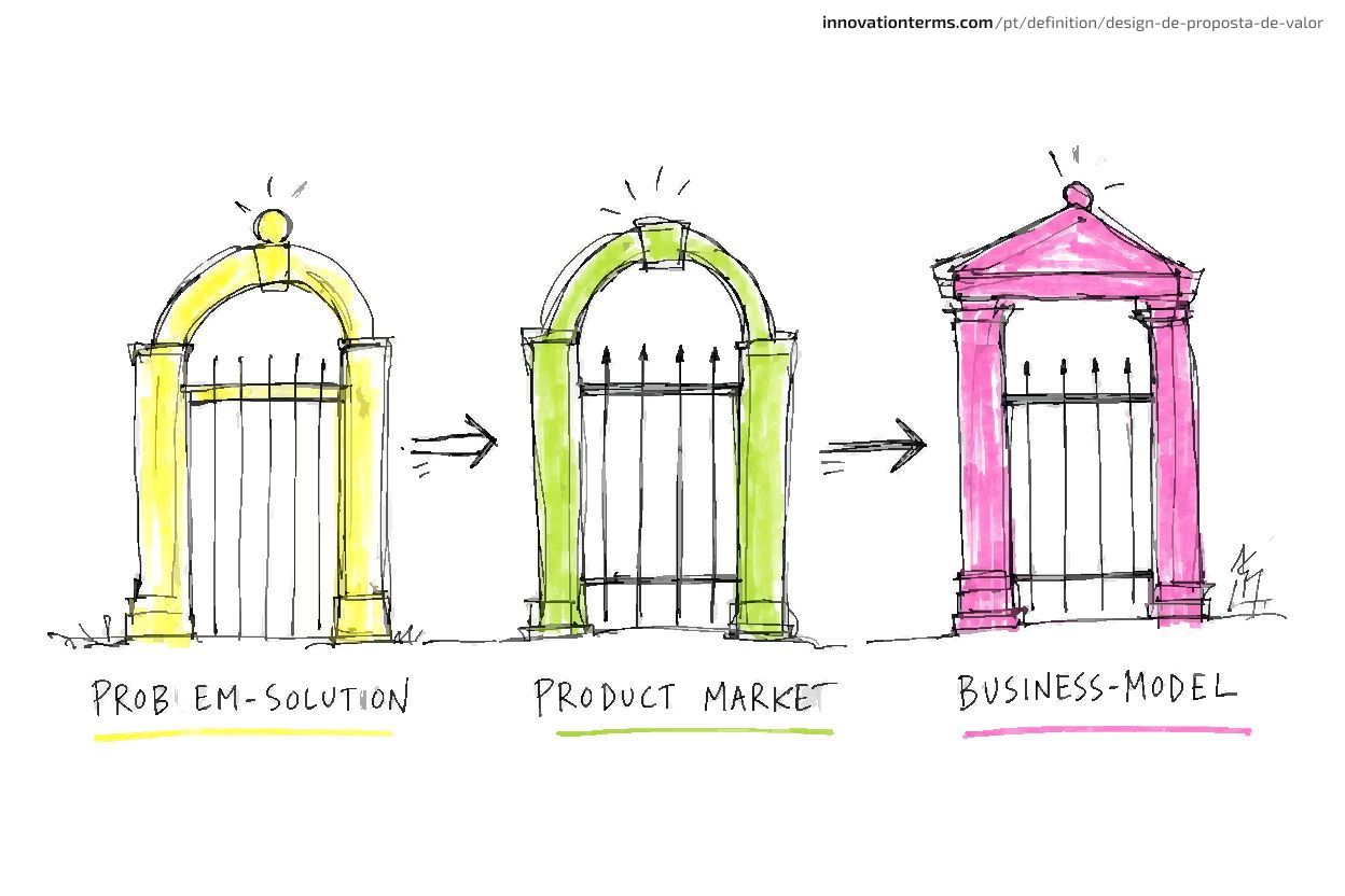
The expensive mistake is to treat the three fits as one. A team draws problem-solution fit on a whiteboard, collects polite enthusiasm in five interviews, and begins speaking as if product-market fit is confirmed. It is not. Interest is not purchase. A nodding head on a discovery call is not retention. Eric Ries made the same point from the lean-startup side:
Startups don't fail because the technology doesn't work. They fail because nobody wants what they're trying to build.
- Eric Ries, Entrepreneurial Thought Leaders interview
| Fit | What it tests | Evidence required | What failure looks like |
|---|---|---|---|
| Problem-solution fit | The problem is real and your value map addresses it | Customers describe the pain unprompted; they react to a prototype or mock | A canvas everyone agrees with and no one will pay for |
| Product-market fit | The market wants it at scale | Retention, referral, repeat purchase, scalable acquisition, not NPS alone | Strong launch, flat retention, rising acquisition cost |
| Business-model fit | The model returns more than it costs | Margins, pricing power, sustainable unit economics | Beloved product, structurally unprofitable business |
Many documented failures attributed to "bad luck" or "timing" are gate-collapsing in retrospect: a problem-solution sketch was treated as a market validation verdict. Teams that run a phased process such as the Stage-Gate model already think in these terms. The three fits apply the same discipline to the value proposition itself.
What do the numbers say about discovery failure?
Skipping rigorous customer discovery has a measurable cost. Roughly four in ten startups build something no market wants, a failure that emerges long after the canvas was filled in and long before anyone called the failure a discovery failure.
Rigorous discovery has a measurable payoff: the rate at which products fail for want of a customer.
42-43% of startups fail because there is no market for what they built. The original 2014 CB Insights reading put "no market need" at the top at 42%; the maintained version that analyzes shutdowns since 2023 still lands 43% on poor product-market fit as a root cause.
| Stat | Source | What stage of discovery it measures |
|---|---|---|
| 42% "no market need" (2014); 43% poor PMF (root cause, post-2023) | CB Insights | Before and after the canvas: the segment or the pains were wrong |
| ~70% "ran out of capital" (top symptom) | CB Insights | After launch: the cost of building the wrong thing |
| 72% of new products fail to meet expectations | Strategyzer | At launch: customers did not care |
The problem is large, stable across a decade, and expensive. Value proposition design exists to close that gap before the build commitment, specifically through the market validation loop the canvas sets in motion.
How to fill the canvas without fooling yourself
The Customer Profile comes first, and the canvas is finished only when it is a testable hypothesis document, not when every box is full. A finished canvas is not a deliverable. It is a list of guesses you have written down neatly enough to test.
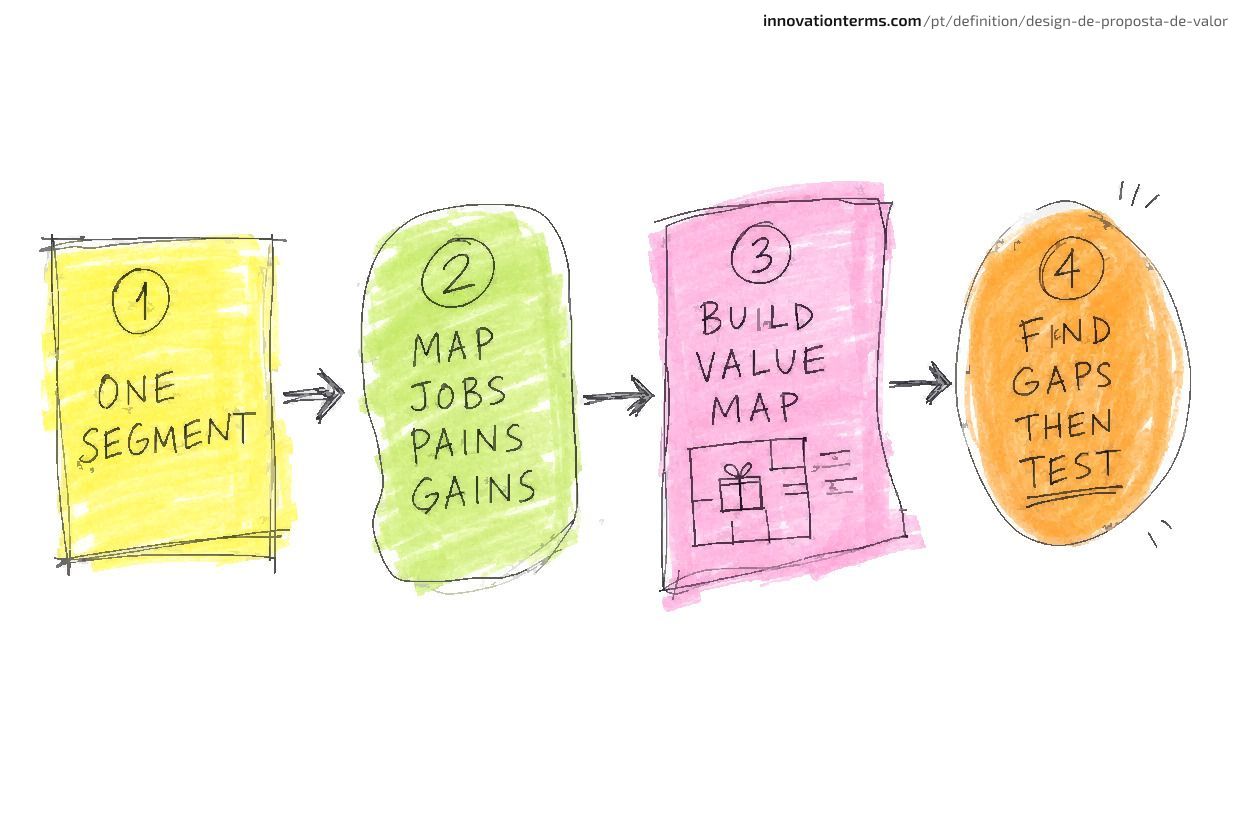
Step 1: Narrow the segment to one
One canvas, one segment. The single most common structural error is mapping "our customers" as if they were one person. If two groups have different jobs, they need two canvases. Mixing them produces a profile vague enough to fit everyone and sharp enough to serve no one.
Step 2: Map jobs, then pains, then gains, by priority
Work the circle in order and rank by importance, not completeness. A profile with fifty items and no ranking is as useless as one with three. The aim is to know the top jobs and the pains that hurt most, because those are the only ones the Value Map needs to win.
Step 3: Build the Value Map as a response
Only now turn to the square. For each pain reliever, name the pain it relieves. For each gain creator, name the gain it creates. Anything that points at nothing on the right comes off the canvas. This is where back-fill is defeated by sequence: you cannot reverse-engineer the profile if the profile already exists in evidence.
Step 4: Find the gaps, then design the test
Look for high-priority pains and gains your Value Map does not address. Those are the holes. Then design the observation that would confirm or kill your assumptions, because the canvas is the beginning of testing, not the end of design. Osterwalder's instruction is to go and check:
You should never believe what people say, because what people do and what people say is not the same thing.
- Alex Osterwalder, Strategyzer interview
Expect to iterate: get out of the building, run innovation feedback loops that capture revealed preference (what customers actually choose and pay for, as distinct from what they say they want in an interview), and return to the canvas. In a FranklinCovey podcast interview, Osterwalder frames this as going out to check with customers if this really addresses their pains and creates gains. Filip Valica captures the stakes plainly: "you're de-risking the product by having conversations with potential customers." Denzil Eden adds the lightweight test mechanism: "I would create a landing page with different value propositions and see which one is driving more users to it."
How one team ran the loop: a mini-case
The Value Proposition Canvas produces its most important output not when it is first filled in, but when the second version looks nothing like the first. Hilti's documented shift from product sales to fleet management is the clearest example of this: the same team, with the same tool, reached a completely different value proposition by looking at a customer they had overlooked.
The method demands iteration: Hilti's canvas at version three looked nothing like version one. Hilti, the construction-tool manufacturer, is the documented example.
Hilti's first, implicit value proposition was the obvious one for a tool maker: build the best drills and sell them to the people who use drills. The Customer Profile, had they drawn it then, centered on the tool-crib manager and the jobsite project leader, whose job was having working tools on hand. The Value Map answered with product quality: the most reliable, most durable tool.
Then they looked harder at the customer and found a different buyer with a different job. The contractor's executives did not care about owning the best drill. Their jobs were keeping crews productive, controlling cost, and cutting the administrative drag of managing a tool fleet that broke, got lost, or got stolen. Their pains were downtime and unpredictable capital expense, not insufficient drilling power.
So the canvas changed. Hilti re-segmented from the jobsite tool user to the CEO and CFO. That shift forced a rebuilt Value Map around a job no drill could do. It launched fleet management: customers pay a monthly fee and Hilti guarantees tool availability, handles repair and replacement, and absorbs the logistics. The new value proposition relieved the executive's real pains, unpredictable cost and downtime, and created a new gain: uptime as a service. Hilti, in the framing the case is remembered by, stopped selling drills and started selling holes.
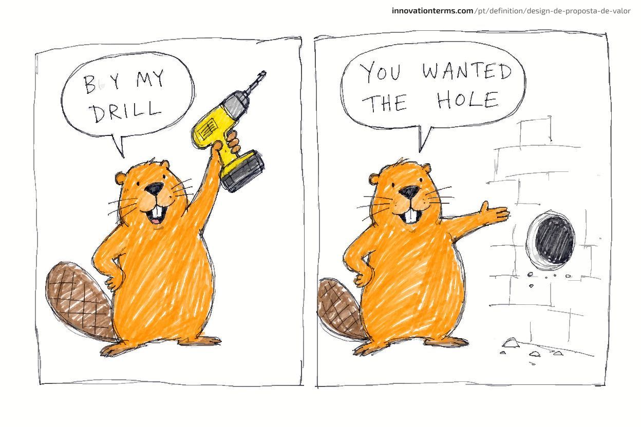
Hilti shifted from selling tools to selling fleet management contracts. Strategyzer's Hilti case study puts customer loyalty under fleet management at roughly five times higher than under the old product model.
What do most teams get wrong about the Value Proposition Canvas?
The misconceptions that cause the most damage concern how teams use the canvas, not what its components mean. Strategyzer's catalogue of common mistakes shows most errors are behavioral, not definitional.
- "Fit means filling in every box." Wrong. A full canvas records the breadth of thinking. Fit is validated agreement from customers that your relievers and creators address the pains and gains they actually prioritize.
- "One canvas covers a product category." Wrong. Mixing segments produces a profile precise for nobody. One canvas, one segment, every time.
- "We can fill the customer jobs from what we already know." This is the most-cited mistake in the practitioner literature, and the root of paper fit. Assuming a profile is faster than discovering one and reliably wrong.
- "The canvas is done when it is full." Wrong. The completed canvas is where the test cycle starts, not where work stops, and teams that mistake a filled grid for a finished artifact stop learning the moment the ink is dry.
- "Value proposition design is writing a value proposition statement." This conflates the method with the output. The statement is a sentence. The design is the work that makes the sentence true.
The pattern across all five is the same instinct: treat the canvas as a document to complete rather than a set of beliefs to test. It is impatience with the evidence.
Where the canvas breaks down: documented blind spots
It works best for a single persona in a stable context. Three documented limitations mark where that envelope ends.
The B2B multi-stakeholder gap
The canvas assumes "the customer" is one person. B2B buying rarely is. The economic buyer, the end user, and the technical champion have different and sometimes conflicting jobs, pains, and gains. The end user wants ease of use and safety. The decision-maker wants ROI and low maintenance cost. A single canvas cannot hold both. Linden Innovation's B2B canvas guide cites Gartner data showing the average B2B purchase involves six to ten stakeholders, with enterprise software deals averaging around eleven. The standard workaround is one canvas per stakeholder type, then a separate analysis of where the profiles conflict.
The pricing, distribution, and branding gap
The canvas has no box for pricing, no box for distribution channels, and no box for branding. Yet those three often decide whether a well-designed value proposition ever reaches or resonates with a customer. A perfect Value Map sold through the wrong channel at the wrong price still fails. Intrapreneur Nation names these as hidden pitfalls precisely because the canvas's clean structure makes their absence invisible. Teams improve what the canvas shows and ignore what it omits.
The static-snapshot problem
Every canvas is a snapshot of what customers wanted when it was filled in. Needs move, and a canvas left unrevised quietly decays into fiction. The fix is a refresh cadence tied to new evidence, not the calendar. That also requires being willing to invalidate the canvas entirely when the market contradicts what it currently claims. Continuous foresight practices build exactly this cadence into team operations. Academic work makes a fourth limitation explicit: Belleflamme and Neysen (2021) found that standard canvas tools "miss the specificities of platform-based business models," where value flows between two sides of a market rather than from one firm to one customer. Their proposed fix is a Multisided Value Proposition Canvas that maps value flows for each side of the platform separately, then identifies where those flows interact.
How does value proposition design connect to the Business Model Canvas?
Value proposition design zooms into one block of the Business Model Canvas. The Business Model Canvas (Osterwalder & Pigneur, 2010) maps nine building blocks of a business, and its center block is "Value Propositions," as documented in Business Model Generation. The Value Proposition Canvas takes that single block and expands it into a full two-sided diagram. They are a paired system, not competing frameworks.
Use the Business Model Canvas to sketch the whole business model, then use VPD to put depth and evidence behind the value-proposition block. Skip the second step and the block stays a placeholder, an assertion of value with nothing tested behind it.
The common sequencing error is using the Business Model Canvas alone, treating its value-proposition box as finished, and never zooming in.
FAQ
What is the difference between value proposition design and a value proposition? Value proposition design is the process, the structured method for discovering and testing what an offering should do for a specific customer segment. A value proposition is the output, the one- or two-sentence claim that results. Most teams write the statement and skip the process, which is why so many value propositions read as generic.
Should you fill in the Customer Profile or the Value Map first? The Customer Profile, always. Strategyzer's prescribed order starts with the customer: map jobs, then pains, then gains, then turn to the Value Map and ask which of those the offering addresses. Reversing the order produces paper fit, a canvas that confirms a decision instead of testing it.
What is the difference between customer jobs, pains, and gains? Customer jobs are what customers are trying to accomplish, whether functional, social, or emotional. Pains are the obstacles, risks, and bad outcomes that make those jobs harder. Gains are the benefits and outcomes customers want, not simply what they get when pains disappear.
How do you know when you have real fit, not just paper fit? Real fit requires evidence from customers, not coherence on the canvas. Problem-solution fit is confirmed when customers, through interviews, observation, or behavioral tests, show the problem is real and your value proposition addresses it. Product-market fit needs stronger proof: retention, referral, and demand at scale. Market validation techniques provide the specific methods for each gate.
How often should a team revisit the Value Proposition Canvas? Whenever new evidence arrives, from research, sales conversations, or shifting behavior. Treat the canvas as a hypothesis under review, not a finished artifact. A canvas untouched for six months in a fast-moving market is probably stale.
Does the Value Proposition Canvas work for B2B products? It works, but it needs one canvas per stakeholder. B2B buying involves multiple roles, economic buyer, end user, technical champion, with different jobs and pains, and the average deal pulls in six to ten of them. Map each persona separately, then analyze where the profiles conflict.
How does value proposition design connect to the Business Model Canvas? The Business Model Canvas includes a "Value Propositions" block as one of its nine. Value proposition design expands that block into its own two-sided canvas. Use the Business Model Canvas to map the whole model, then VPD to design the value-proposition block in depth.
Ravi @ravi_p
Escreve sobre ecossistemas de startups, experimentos de crescimento e estratégia de produto baseada em evidências.